
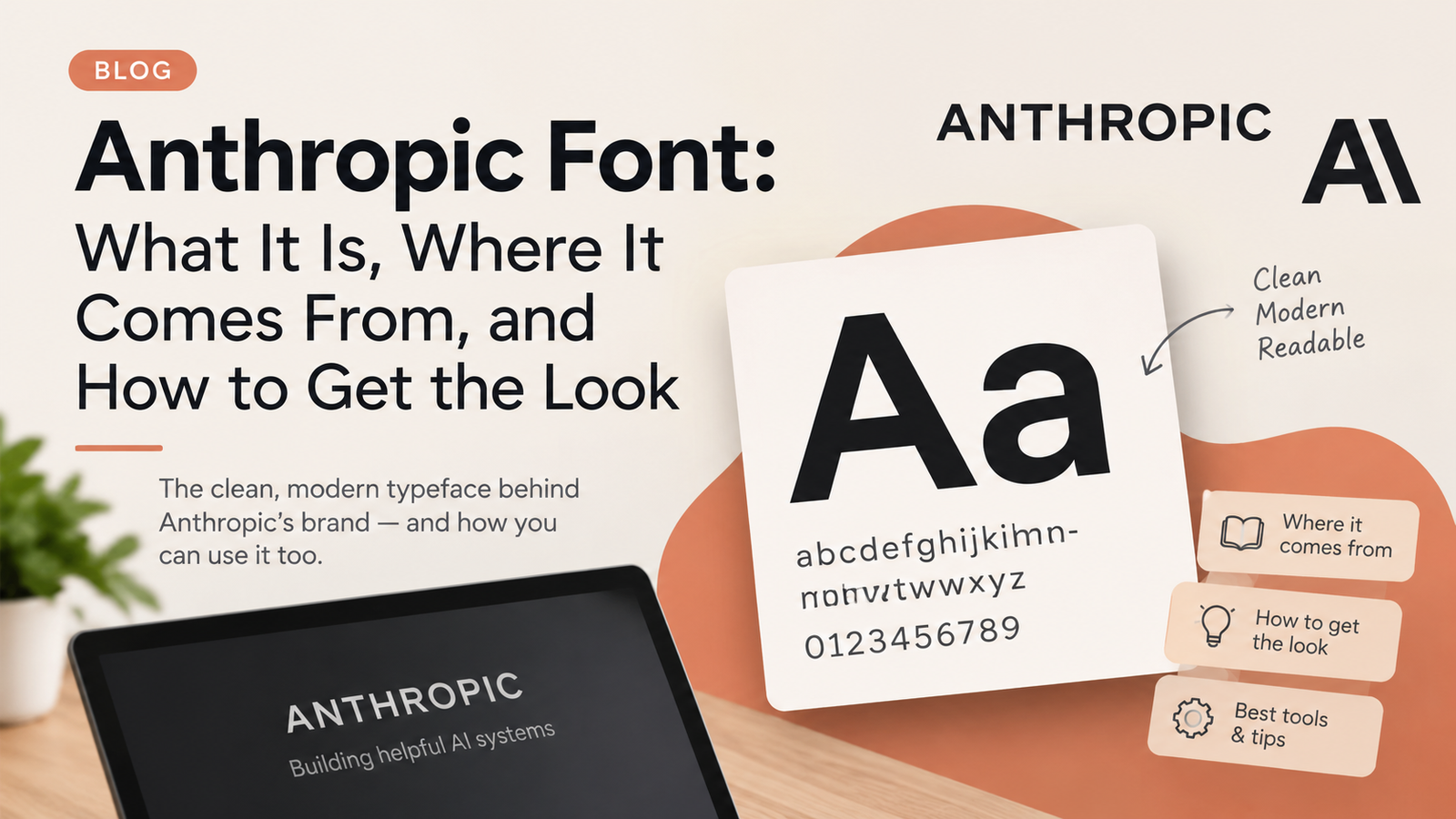
Ask ten designers what the anthropic font is and you may get ten slightly different answers. That is because there is no single typeface behind the company’s look. Anthropic, the AI company that makes Claude, has used a small family of typefaces, and the mix has shifted over time.
This article sorts it out in plain language. You will learn which fonts shaped the brand, what the website uses today, why these choices work, and what to do if you want a similar feel without paying for a license you do not need.
Why So Many People Search for This
The anthropic font question comes up for a few reasons. Designers want to match the warm, editorial look in their own work. Students building presentations about AI want something that feels similar. Developers prototyping a chat app wonder what the Claude interface is using. And plenty of people simply notice that the site feels different from the usual cold tech brand and want to know why.
The honest answer is that typography is a big part of that feeling. Serif headlines, a friendly sans-serif, and generous spacing make AI feel less like a machine and more like a publication you might actually enjoy reading.
Where the Original Look Came From
Anthropic’s visual identity took shape while the company was still in stealth. The design studio Geist worked with the founders for about two and a half years, from before launch through the first product release. The goal was a brand that would stand apart from the usual tech clichés and still feel credible.
The studio chose a typographic palette that combined the Styrene family from Commercial Type with the Tiempos family from Klim Type Foundry. The same project produced the logo treatment, in which a slash takes the place of the letter I in the name. The slash nods to the code underneath AI and to the future ahead.
So the original anthropic font identity was a pairing of two families, not a single typeface. That detail explains why one-word answers tend to be incomplete.
Styrene: The Sans With a Quirky Edge
Styrene was designed by Berton Hasebe and released by Commercial Type. It began as an experiment with proportion. Letters that are usually narrow, such as f, j, r, and t, are made wider and more squarish. The result has a slightly technical, slightly playful rhythm.
The collection has two families. Styrene A is wider and more geometric. Styrene B is narrower and more compact. The Cyrillic characters were drawn by Ilya Ruderman.
Of everything in the anthropic font story, Styrene is probably the most recognizable piece. It carries headings and interface labels with a confident but approachable voice, and it is the thread that still runs through the brand today.
Tiempos: The Reading Voice
Tiempos comes from Klim Type Foundry and was designed by Kris Sowersby. It is a serif family built for reading, with sturdy shapes and a classical feel that holds up well in long articles.
In the early identity, Tiempos handled body copy while Styrene took the headlines. Many tech companies do the reverse, with a serif for display and a sans for text, or a sans everywhere. Using a serif for reading gave Anthropic’s writing a bookish quality that suits a company publishing long research posts and essays.
This is the second half of the early anthropic font pairing, and it explains why many Anthropic pages feel closer to a magazine than to a product page.
What the Website Uses Today
Typography on a living website changes. Recent versions of Anthropic’s site load two licensed families called Copernicus and StyreneB. Copernicus is a serif used for large display headlines. StyreneB handles body text, navigation, and labels. Only a couple of weights appear in the code, regular and medium, which keeps the look light and consistent.
Notice that the roles have swapped compared with the early identity. Headlines now lean on the serif, and the sans does the everyday work. Some design write-ups describe Copernicus as a warm, slightly slab-leaning serif, set at normal weight with tightened letter spacing so that large headlines do not look loose.
Copernicus is a licensed typeface, so it is not offered as a public web font. If you want to describe the anthropic font stack on the main website today, the simplest summary is a serif for headlines and a humanist sans for everything else.
Custom Typefaces and the Claude Interface
A second thing readers ask about the anthropic font is whether the company has designed its own families. Some brand reference sites list in-house typefaces called Anthropic Sans, Anthropic Serif, and Anthropic Mono, meant for interface text, long-form reading, and code. Those listings are third-party summaries rather than official documentation, so treat them as a hint about direction and not as a firm specification.
The Claude app itself is another source of confusion. Different write-ups describe it in different ways, including a serif face for headings and a plain system font stack for the chat itself. The app can also look different on web, iOS, Android, and desktop, and details change as products are updated.
The anthropic font in the Claude app is therefore harder to pin down than the one on the marketing site. If it matters for your project, check the live product rather than relying on a blog post, including this one.
Why This Pairing Works
There are practical reasons the combination feels right. A serif headline signals thoughtfulness and history, which helps a company that wants to be taken seriously on research and safety. A modern sans for interface text keeps buttons, menus, and labels crisp. Together they balance warmth with precision.
Color does half the work. The palette leans toward warm cream, soft tans, and coral tones rather than stark white and electric blue. Type and color behave as one system, and each makes the other look more deliberate.
What makes the anthropic font pairing effective is restraint. There are only a few families, a small number of weights, and plenty of white space. Nothing shouts, which suits a brand that wants to sound calm about a subject many people find intimidating.
Licensing: Can You Download It?
The short answer is not officially. Styrene and Tiempos are commercial typefaces sold by their foundries, and Copernicus is licensed and not available as a public web font. Anthropic does not hand these out as free downloads, and files that appear on random sites are often pirated or attached to broken licenses.
If you need the real fonts for a legitimate project, buy a license from the foundry. Licenses differ for desktop, web, app, and print use, so read the terms before you commit, especially for commercial work.
In practice, there is little reason to hunt for a free anthropic font download. The legal route is often modest in cost compared with the risk of an infringement claim, and free alternatives can get you most of the way anyway.
Free Alternatives That Get Close
No free font matches the originals exactly, but a few come close in spirit. On the sans side, Inter is a common pick, and some brand guides suggest it as a stand-in for StyreneB. DM Sans is another clean option with friendly proportions.
On the serif side, Source Serif, Newsreader, and Literata all offer a warm, readable feel that suits long text. For large headlines, some designers reach for Cormorant Garamond at a medium weight with slightly tight spacing, though it is more delicate than Copernicus.
When choosing an anthropic font alternative, test it at real sizes. The charm of the originals comes from proportion and spacing as much as from the shapes of individual letters, and a font that looks right in a preview can feel off in a paragraph.
How to Check What Any Site Is Using
You can verify typography yourself in a couple of minutes. Right-click a headline in your browser and choose Inspect. In Chrome, open the Computed tab and scroll to the rendered fonts section, which shows exactly which family drew that text. Firefox has a Fonts panel that does a similar job.
Checking the anthropic font this way on a live page will tell you more than any article, because sites update their typography without notice. It is also worth reading the font-family line in the styles, since it shows the fallback order the browser uses if the main font fails to load.
Designing With the Same Spirit
If you want a project to feel like this without copying anything, borrow the principles. Pair a characterful serif with a clear sans. Use only a few weights. Give big headlines a little negative letter spacing and body text a generous line height. Keep the color palette warm and slightly muted.
Think in roles. Let the serif carry the voice and the sans handle the tools. Limit yourself to two families, because the restraint is what makes the result feel confident rather than busy.
Anyone borrowing from the anthropic font approach should also remember that fonts are only one part of a brand. Voice, imagery, spacing, and the way a product behaves carry just as much weight, and none of them can be installed from a font file.
Final Thoughts
The short version is this. Anthropic’s typography began as Styrene plus Tiempos, moved toward Copernicus and StyreneB on the website, and is described by third-party sources with a few in-house families as well. Details can change, so the live site is always the final word.
The anthropic font story is really about warmth and restraint more than about any single typeface. If you need the exact files, license them properly. If you want the feeling, use a good free pairing and the design habits above. And if you want to know what is live today, inspect the page and look for yourself.
Read more trending Blogs on Zio Magazine.